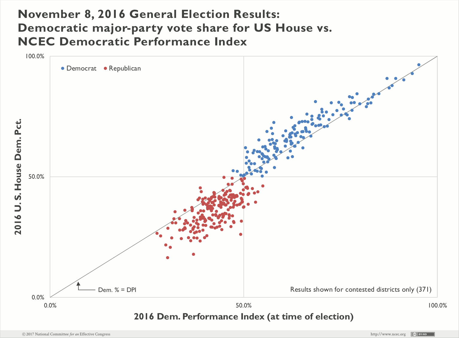
The NCEC’s Democratic Performance Index is a granular, moving average of actual candidate performance. It should be no surprise that, on average, observed party performance correlates with future party performance more strongly than any other single measure.
According to CNN, Rep. Sean Patrick Maloney (D-N.Y.) has “…developed a new data model to replace the DPI, using 350 different data points.” Models intended as leading indicators of candidate performance are regularly improved when they incorporate actual candidate performance. In fact, DPI itself commonly serves as a supporting data point for building the very types of sophisticated models Rep. Maloney refers to. Considering the diversity, educational attainment, and geography of an electorate is important and should be used, in combination, with a robust measure of the electorate’s voting behavior—not in place of it.
The NCEC calculates DPI for every state at the precinct level—the most detailed level at which election results are recorded. DPI is not a speculative model trained on disparate data points nor should it be. The strength of DPI is that it is so closely anchored to direct measurement of what actually happened. It is most valuable as a measure of a district’s relative partisanship. It is not intended to predict the outcome of an election, but rather to indicate competitiveness or lack thereof.
In the same article, Rep. Jim Himes (D-Conn.) disputed DPI’s accurate measures of last year’s congressional battleground. But nationally, Democrats won only four districts where DPI was below 50 percent. Two of these contests, MN-01 (DPI 49.9%) and MN-07 (DPI 47.3%), outperformed DPI as expected thanks to the long-time incumbency of the Democratic candidates. And the other two districts correctly identified as close contests—NJ-05 (DPI 48.3%) and NV-03 (DPI 49.3%)—were subsequently targeted with well-resourced and well-run campaigns. Victories here demonstrate the successful identification of marginal contests and the judicious mobilization of campaign resources to effect change in favor of Democrats. And while DPI served as a good indicator for races where Democrats were more likely to lose, it correlated even more strongly in higher DPI areas where Democrats were more likely to win.

In the Washington Post, Paul Kane highlighted Minnesota’s 2nd District as an area for scrutiny. The pre-election DPI for this district was 49.3 percent—an outstanding match to the major party performance of both Hillary Clinton (49.3%) and Angie Craig (49.0%) in the general election. Craig’s 2-point loss narrowly trailed the Democratic Performance Index by 0.3 points. The race was competitive to the end, and choosing not to compete in a district like this in the future guarantees Democrats permanent minority status.
Stephanie Murphy’s victory in Florida’s 7th District was repeatedly heralded as a surprise Democratic win. But the Democratic Performance Index strongly suggested this was a toss-up district well within the reach of a competent campaign. Once the Florida redistricting lawsuit was finalized, DPI was re-tabulated for the new geography and increased from 45.6 to 50.8 percent under the reconfigured map. Again, this is where the Democratic Performance Index is most valuable—in measuring change and gauging the strengths of geographic units against one another. The DPI is not used by itself to make these decisions, but provides a grounded basis (grounded in actual candidate performance) from which to make informed judgements on voting behavior.
Pennsylvania’s 8th District is another seat where the Democratic candidate underperformed. Democrat Steve Santarsiero lost by 9.0 points, but the baseline indicators were nevertheless sound. The pre-election DPI in this district was 50.6 percent which tracks closely with Hillary’s 49.9 percent in the general election and President Obama 50.0 percent in 2012. Voters here are clearly open to supporting Democratic candidates in general, and this is exactly the type of suburban district that should be targeted if Democrats are ever going to regain control of the House.
It’s true, Democrats underperformed in some rural districts last cycle, particularly in Iowa. But the rationale to compete there was sound, given that President Obama won three of the four districts in consecutive general elections. And in the case of Iowa’s 1st District, every Democratic presidential candidate has carried it since 2000. President Obama won 56.9 percent of the vote there in 2012, surpassing average Democratic Performance by 1.9 points. This district clearly qualified as a top-tier target especially in an election year as volatile as 2016.
Some have suggested that the Democrats should focus less on rural districts, but any realistic look at the battleground shows that without winning some rural districts, there is virtually no way to build a coalition that reaches 218 seats. Considering the long odds presented by partisan gerrymandering, Democrats must continue to pursue an all-of-the-above strategy in districts where recent results suggest the possibility for success
Democratic Performance Index by itself tells only part of the story; it is always prudent to perform wider analysis. But in our search for better tools, we must always remain anchored in direct measures of reality.
